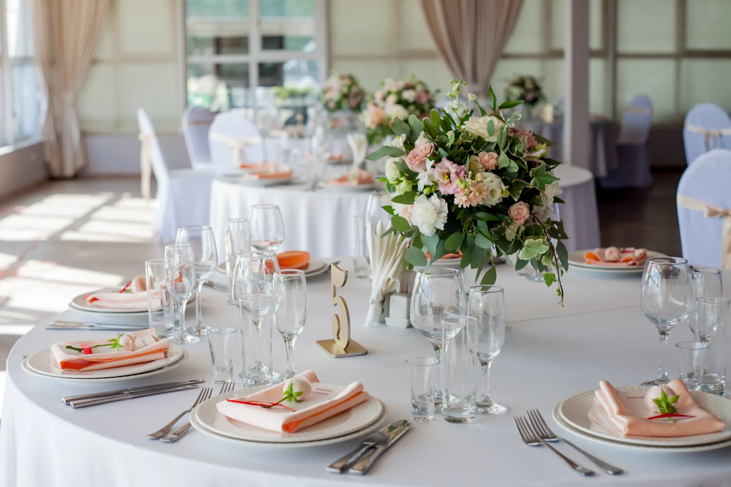
Build the site the way a couple plans. Colour first, since the palette is decided early and everything else is chosen to match it, so each colour deserves a hub page pulling favours, stationery, table pieces and ribbon into one place with real styling notes. Theme hubs sit beside them for the looks people name: rustic, coastal, modern minimal, vintage, garden. These pages hold their value year after year and gather links from planning content across the web.
The second layer is the practical guide set, which is where a lot of early demand lives. How many favours to order for a given guest count, what goes on a welcome table, how to lay out a place setting, when to order stationery relative to the date. Couples read these months before buying, and a brand that answers well is still in mind when the order is placed. Each guide should link to the colour and theme hubs rather than dead-ending.
Technically, colour naming needs to be consistent between the product title, the colour attribute, the filters and the copy, because that is what the shopper searches with. Keep photography original, since colour accuracy cannot be borrowed from a supplier image, and make sure stock levels are visible on quantity-driven products so a page that ranks does not disappoint the visitor it earned.